Wednesday, October 31, 2018

Shoot 6

Shoot 6

Artist Influence - Erwin Olaf

AO1: Develop ideas through sustained and focused investigations informed by contextual and other sources, demonstrating analytical and critical understanding.


Erwin Olaf takes photos that I believe have been very thought out and planned. Each of his images use very tonal colours and don't include any vibrant or saturated colours. Also I think it is interesting how all of his photos include flowers that have been purposefully placed in a vase, out of their natural environment. I feel as though this could have connotations of the plants being trapped in pots and homes and not being able to grow into beautiful bright plants. I was very intrigued by the composition of Erwin Olaf's photos because the plant is in the  centre of the frame. Many other photographers I have looked at have a lot of negative space around their image however he has purposely tried to fill the negative space with a homely scene. This could have implications of people using flowers as an aesthetic centre piece in their homes rather than appreciating nature. The main element of Erwin Olaf's work that I would like to incorporate into my own is to use backgrounds and create a scene rather than just taking an image of a flower with negative space surrounding it. 

Images that have inspired me 


Both of the images above have mainly influenced me due to the bright colours that have been used. Erwin Olaf tends to use very monotone colours within his work which I do like as it gives the whole image a formal and organised feel however during this shoot I wanted to experiment with the use of colours and patterns and the images above inspired me to do so. 


Contact Sheet


Throughout this shoot my intentions were to capture photos with different backgrounds. I wanted to create an element of a window sill and a set up of a homely environment. I feel as though an unsuccessful element of the shoot was the materials that I had in order to complete the shoot. I was only able to purchase fairly small pieces of paper to use as a wallpaper. This meant that I struggled to incorporate negative space within my images and it also meant that all of my photos had to be taken relatively close to the subject of the photo. This is something I would change if I was going to complete this shoot again. Something that was successful during the shoot was the angles at which I was shooting. I feel as though I made good use of the space that I had whilst shooting.

My Best Images 

AO1: Develop ideas through sustained and focused investigations informed by contextual and other sources, demonstrating analytical and critical understanding.


I have chosen each of the images below as my best because I feel these are the strongest images I have taken. An unsuccessful element of each photo is that the white background behind the paper I used is slightly visible. This was because I was not able to get hold of larger pieces of paper. This is something that I will fix when editing each of the images. Initially during the shoot I was trying to take photos of just the flowers within the vase however I decided to use the table that the flowers were sitting on to try and crate the illusion of a window ledge. I think that by doing this my photos reflected Erwin Olaf's work a lot closer. A successful element of my photos is that I like the use of the different backgrounds because I feel this entire shoot contrasts with my previous shoot which was done using a black background and very dark precise lighting. 

Each of the photos used an aperture of f/18, an ISO 200 and a shutter speed of 1/125. 


Images that Require Improvement 

AO1: Develop ideas through sustained and focused investigations informed by contextual and other sources, demonstrating analytical and critical understanding.


F/18    1/125    ISO 200
This photo requires improvement due to it being under exposed. When shooting this photo I used the same camera settings as many of the successful photos I have taken however this image was underexposed due to a technical fault. When shooting the trigger on my camera did not process that I was taking a photo and therefore did not allow the soft box to flash. This resulted in the photo being over exposed. I think the reason this happened was because I did not leave enough time in between capturing each photo therefore the trigger did not work. Due to this happening I have learnt to take my time whilst shooting to enable me to get the best results. 

f/11   1/125   ISO 200
This photo is slightly over exposed. This photo was taken relatively close to the start of the shoot and I was slightly struggling with capturing the correct camera settings. I used an aperture of f/11 however looking back on the shoot now, this aperture was too low because the soft box lights were on a high setting. This meant that by using a smaller aperture too much light was being let into the lens and the photo was coming out over exposed. Once this had occurred I learnt from this and used a higher aperture throughout the rest of my shoot and I was very happy with the exposure of my images. 


Camera Setting and Equipment

AO2: Explore and select appropriate resources, media, materials, techniques and processes, reviewing and refining ideas as work develops.


When completing this shoot I used a canon eos 400d. I shot the photos in a studio so that I could closely control the lighting and the camera settings that I wanted to use. I used an aperture ranging from f/11 to f/18. I used lower apertures like f/11 during the start of my shoot because I was experimenting slightly to get the correct camera settings. I found that using f/11 resulted in my photos being very over exposed therefore I tried to use f/13 then f/16 and eventually I used f/18 and I felt this gave me the best exposure. With regards to the shutter speed I used 1/125 throughout the shoot. This shutter speed was used because I wanted to freeze motion and also because this worked very well with my lighting set up to give me the correct exposure. Throughout the shoot I used an ISO of 200 and this remained the same during the entire shoot. If I had of used a lower ISO the camera would have not been sensitive enough to the lighting and my photos would have come out under exposed and if I had of used a higher ISO, for example ISO 400, my photos would have turned out over exposed due to the camera being too sensitive to the lights that I used. 

Below are some images of the setup that I used in the studio. To attach the pieces of paper to the wall I used a foam reflector and some pins to hold the paper up. I then used two soft boxes to create an even amount of light coming from both sides of the image. I also used a tripod to ensure that I was getting the correct composition. In this shoot the composition was very important due to the size of the paper I used as a background. The paper was quite small and therefore I wanted to make the best use of the small space that I had therefore framing the photo allowed me to do this successfully. 


AO3: Record ideas, observations and insights relevant to intentions, reflecting critically on work and progress. 

The main source of inspiration for this shoot was from my research in Erwin Olaf and his work. I took a lot of compositional inspiration from his work because I wanted to try to create a scene within my image rather than just having a black or white background. I used the table to create a shelf like structure to the image. This was directly taken from the way in which Erwin Olaf uses a table or a shelf within his images to rest the vase of flowers on. Erwin Olaf's images use very neutral tones like white, black and brown. I wanted to experiment with slightly more colour than this because I was unsure whether colour was going to be a focus within my project because I had not explored this in enough detail. In order to gain inspiration to explore colour I used google and pinterest to gather different images that included saturated colours. Once looking through many different images I went to a local craft store and I had a look at the different wallpapers that they had on offer. I feel as though this then inspired me to use some unique patterns as backgrounds rather than just plain colours.


Edits

AO2: Explore and select appropriate resources, media, materials, techniques and processes, reviewing and refining ideas as work develops.

 Edit 1

Firstly I created a blank document of photoshop. I altered the width and height to make sure that the document was landscape rather than portrait. 

I then cropped each of the images that I wanted to use in order for them to all be the same height. I also had to slightly crop the top of the images as some of the foam reflector was visible due to the size of the paper. This is something I mentioned when evaluating my photos. 

I then selected each image I wanted to use by clicking cmd+A and then copied it by clicking cmd+C. I then pasted each of the images into the blank document I previously created by clicking cmd+V. 

I then altered the images using cmd+T. This step took time because I wanted the photos to all be the same size. I also wanted to ensure that the gaps in between each of the photos were equal. I then used the crop tool to crop the edges of the image to make the border around the edge equal. 

I then merged each of the layers together to enable to me edit the entire photo as a whole. 

I then altered the brightness and contrast of the image because I felt as though the contrast needed to be enhanced slightly. 

My Final Images 

AO4: Present a personal and meaningful response that realises intentions and, where appropriate, makes connections between visual and other elements.


After exploring the idea of using brighter coloured backgrounds and trying to cease a scene within the image I have decided that I would not like to take this technique any further. I like the way in which the backgrounds I have used add an element of colour and texture to the images but I do not feel as though this idea would fit with my overall portfolio. By completing this shoot I feel as though I have learnt that I want to focus on darker images possibly using snoot attachments for the lights in a studio rather than a soft box. By doing this shoot I am not able to focus my project and aim towards my final portfolio. 


Progression

To progress my photography skills I would like to focus on the use of negative space within my photos and use space effectively. I feel as though during this shoot I have not been able to do this due to the size of the pieces of paper I was able to use as backgrounds. To progress I would like to focus on the use of negative space. I believe that although I have looked at studio photography which is something I wanted to explore, the colourful backgrounds are not something that I feel work for me. I would like to look at some darker backgrounds however there are elements from this shoot that I feel I can take away and use such as lighting setups within the studio. 


Essay

'Documenting the life of natural forms' 

Introduction

My personal investigation is centred mainly around flowers however the overall theme of the project is natural forms. During my project I would like to portray the life cycle of flowers and show slightly less aesthetic parts of nature but make them interesting in their own way. The study of flowers and natural forms is an important topic due to the way in which the world is constantly changing. Global warming is said to 'disrupt the flowers' blooming cycles and some whole flower groups might perish'. This suggests the importance of photographing flowers. By showing the drastic change that the world is having on natural forms may cause people to have much more respect for the environment. Photographs can preserve the beauty of nature for the future. Throughout my project I have been influenced by a number of photographers, some of which include: Irving Penn, Nadege Marieau and Imogen Cunningham. By investigating these photographers in more depth I was able to incorporate different techniques and ideas into my work which challenged my own photographical abilities.

History and Contextual Study 

A daguerreotype was the first photographic process that became successful. These cameras, which were first created in 1839, had exposure times from 5 to 30 minutes. This made it extremely hard to photograph portrait photography as people were not able to stay completely still for this length of time, therefore still life photography was a way of capturing images with the exact composition photographers intended. This camera was accurate, detailed and sharp. After the production of the daguerreotype camera, many people were trying to replicate this and improve upon the original item. This then led to Charles Chevalier creating a double-box camera in 1841. This camera used the same principles as the earlier invented camera however it used a plate which was half the size of the original camera for imaging. In addition the camera had a faster lens which meant that the exposure time was bought down to 3 minutes.


The first photo that is known to be taken was by Joseph Nicéphore Niépce in 1826. In order to achieve this he bought a van and converted it into a mobile darkroom. The van included many types of photographic equipment but most importantly five cameras. This was a photo taken in black and white which was similar to Roger Fenton's still life photography in 1855. It was not until 1861 that the first coloured photo was created by James Clerk Maxwell. This was done with three different coloured filters that were overlaid to create one single composition. Maxwell used this technique based upon the way in which the human eye processes colour.   


Ernst Haas is known as 'the early master of colour photography'. Haas used a black and white film for a lot of his career however he did experiment more by using colour film which became an important part of his work. The techniques used by Haas were frequently used in order to capture the images he produced. Some examples of the techniques he employed are shallow depth of field, selective focus and blurred motion. Haas's photography evolved over the years as he continued to put his love for poetry and music into photographs. In the 1940's Haas decided to switch from using his 'medium format Rolleiflex to the smaller 35mm Leica rangefinder camera. In order to print his coloured work he used the dye transfer process. Although this was an expensive way of printing it resulted in almost full control over the hue and saturation of the images. 

Still life translates to nature morte which also means dead nature. This was the entire idea based around still life photography and this offered a lot of freedom in the world of photography as it was the first time photographers were able to have full control over the composition of their work. They were able to place objects in the exact place they desired. The most common subjects of still life were cute flowers, picked fruits, seashells and caught fish. Still life photography captured anything that is dead or not moving. Still life has gradually tended to include anything that does not move rather than the dead however elements of dying or rotting items add another element to the image and can bring texture and depth to the photo. 

Traditionally in still life arrangements objects were placed in specific places however it was all done for a meaningful reason. This is something that has continued throughout the history of still life photography. Still life photographers will place objects in desirable places however as photography has become more accepted photographers have began to experiment and look at the anti-aesthetic of photos rather than just the beauty. Roger Fenton was a still life photographer in the 1800's and he embarked on a series of 35 to 40 still life images containing flower arrangements and fruits on marble or fabric. Fenton would shoot relatively close to the still life composition and it would be at eye level. His images focused on textures and detail. Stereo photography was a technique that Roger Fenton used within his work. It was used within the 1950's and involved creating a 3D illusion. A stereoscopic camera was used and it took two images at the same time but with slightly different viewpoints. The photographer could also take two separate photos but move the camera in between. 

This is Roger Fenton's most famous still life image that he captured. 


Photographer Research

Imogen Cunningham 

Imogen Cunningham was an American photographer who was well known for her botanical photography. Cunningham had an interest in photography from a young age and bought her first camera from the American School of Art in Scranton, Pennsylvania. The camera has a 4x5 inch view. Cunningham opened her own portraiture studio in Seattle however when she got married her and her husband moved to San Francisco. Imogen Cunningham continued to pursue her passion for photography and became a lot more interested in botanical photography as her career progressed. Cunningham was involved with the f/64 group. This group was known for its sharp and un-retouched images. The photos created by members of the f/64 group featured much detail and greater depth of field. Other members of this group include Ansel Adams and Edward Weston.  


amaryllis flower, 1933
The image above is of amaryllis flowers which have been placed in a pot. Cunningham has used light in a very interesting way within this image. She has projected light onto the right side of the flower and has not used any light to brighten the other side of the flower. This gives the look of the plant being two different flowers. I feel as though the idea that the flowers look completely different could have connotations of people having two different personalities, one that they portray to other people and another that they tend to hide. I am particularly drawn to the centre of the flower on the left side of the image because it is completely black. I feel as though this resembles the idea of a never ending black hole. I like the questions this brings up about why the photographer chose to completely black this area out. I believe it could show the importance of nature being eternally important.    

Calla, 1925
The photo above is of a calla flower. Cunningham has focused on the shadows and shape of the flower. I feel as though the image uses the contrast of harsh and lighter shadows to create the perfect exposure. I believe the harsher shadows could suggest that the perfection of the plant is being disturbed in some way. This could have further implications of humans disturbing nature in unhealthy and dangerous ways. Cunningham has decided to lighten specific parts of this photo which has resulted in the photo being centred on the shape of the flower. For example she has darkened the areas around the flower which created a focal point of the centre of the flower. For me, the punctum of this image is the harsh shadow that the flower has created on itself. This is interesting because the calla flower has been associated with holiness, faith and purity. The dark shadow could contrast this association and may show that not everyone can be pure and faithful in every situation.   

Datura Flower, 1975
The image above uses different shadows to enhance the shape of the flower. I like the way in which the shadows have been carefully thought about the create softer and harsher details within the image. I think that the shape of the flower looks as though it is very elegant due to there not being many harsh lines or curves within the outlining of the flower. In my opinion the shape of the flower could have representations of a ballet dancer due to the elegance of certain parts of the flower. Ballet is associated with elegance and beauty and I feel this is an idea that Imogen Cunningham is trying to convey within her work. There is a harsh contrast between the black background and the light areas of the flower. I feel as though this has connotations of differences within peoples personalities. 

Irving Penn

Irving Penn is known as an important master of modern photography. He captured many different genres of photography however I am focusing on his still life of flowers. His work has been displayed in renowned public and private photography collections. Irving Penn's flower series happened due to Vogue USA who asked him to photograph flowers for the 1967 Christmas edition. This resulted in the next seven years devoted to photographing a different flower. He photographed tulips, poppies, peonies, orchids, roses, lilies and begonias. 

The image above is of a poppy that is slightly dried. Irving Penn aims to capture the fine beauty of flowers. This is done through the use of texture and colour. This photo uses orange and red tones with a green and yellow centre. The red and green tones are complimentary of each other and this is why they work so well within the image. The idea of shooting a poppy has a lot of symbolic meaning because the poppy represents the end of the war as this was the only flower still growing in the battlefields. The idea of the poppy being slightly dead could represent the long period of time that the war was continuing for and due to it not being completely dead could represent the strength of the soldiers during the war and the idea that they did not give up. I like the use of negative space within this image because it focuses your attention onto the flower itself. I am specifically drawn to the petals of the flower due to the amount of detail that Irving Penn has captured. I like the way that the petals are slightly creased which I think could have connotations of imperfections within people and not being ashamed of them.  

The image above is of a rose that is dying. The flower looks as though it has been pressed and dried. This has resulted in the flower being thin and the white background being ale to show through the flower. This implies that the flower is fragile, much like people when they have lost someone they love. A red rose conveys deep emotion, mainly love. The fact that the rose is dying could have connotations of people falling out of love or love being lost within peoples lives. Also the fact that the flower has fallen downwards could represent peoples body language after being hurt of broken by love. People may hold their head down as a sign of sadness. I like the way that this image is on a pure white background because white has connotations of purity and peace which I believe contrasts the dying rose which has connotations of being in pain and losing someone you love.  

Relevance of the photographers research to my personal project

My project is focusing on documenting the life of natural forms and I have tried to closely relate my work to the photographers I have researched. I have focused on a number of photographers throughout my work, for example Irving Penn, Imogen Cunningham and Nadege Meriau. 

Irving Penn


My photo closely relates to Irving Penn's photo due to the flower being the focal point of the photo. I also wanted to use the same camera angle as Irving Penn because I liked the idea of the camera looking directly at the flower. The compositions of these two photos are very similar due to this being  a main idea that I took from Irving Penn's photos. Irving Penn uses a very soft light to create the image above whereas I used a spotlight which gave my photo different connotations, for example slightly darker colours may imply a slightly more sinister tone. I feel as though this image Irving Penn has created focuses heavily on the colour, especially the vibrant saturated yellow in the centre of the flower. I also wanted to replicate this throughout my work because although the photo I have taken is slightly darker I wanted to enhance the orange tones within the flower. Although my photo relates to Irving Penn's photography I also wanted to incorporate my own ideas within the photos I produced. This is why I decided to use a dark background. The darker background relates to the other photos that I have produced and having a black background will result in my portfolio photos having a related theme. 

Imogen Cunningham


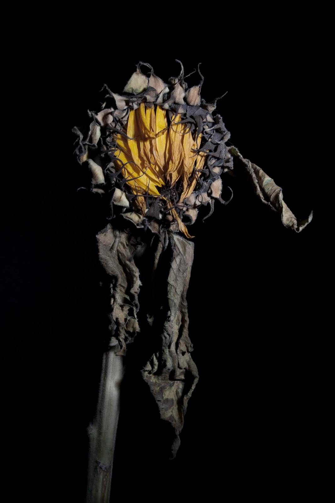
I feel as though the photo that I have taken of the sunflower relates to Imogen Cunningham's image above. I was very inspired by the way Imogen Cunningham takes a very simple flower and expresses so much intricate detail throughout one picture. I aimed to photograph one flower that I felt had a lot of different textures within it and I used compositional ideas from Cunningham by having the flower in the centre of the frame. I also incorporated negative space within my image which I believed to be an important part of Cunningham's photos because this is what drew your eyes towards the flower. Although Cunningham's photo is in boac and white I decided to desaturate the colours within my image. I believe this related to the other photos I have taken more than if I were to alter the image to black and white. I also like the fact that this gives my photo a slightly different element to Cunningham's photo. When photographing the image above I took in mind Imogen Cunningham's role in the f/64 group which focused on capturing the greatest possible depth within their images. Due to this when taking my photo I used an aperture of f/16 to try and capture as much depth within the photo as I possibly could.    


The Future

The future of photographing natural forms has the potential to change and alter in the future. Due to global warming increasing at such a fast place the world is constantly changing. Certain flowers, for example orchids, are at higher risk of being impacted by global warming than some other natural forms. Due to this photos of natural forms may be seen as history some time in the future and photographs could be essential to understanding the impact that global warming and deforestation is having on the environment. As technology has developed and lenses have been developed, such as macro lenses, photos have been able to be captured in such intricate detail which is something that has never been done before. Although cameras are constantly being created, mobile phone quality has improved drastically and photos like the ones seen above could be created on a mobile phone. This may result in professional photography becoming decreasingly popular due to the ease of being able to get the same results with a mobile phone.  

Conclusions 

Overall, my project has been heavily influenced by Imogen Cunningham and Irving Penn's work due to the composition of their photos and also due to the way in which each of these photographers express details within flowers in their own way. In particular Imogen Cunningham's photography has influenced me due to being a part of the most famous movement in the history of photography. In my opinion Cunningham's photography changed the way in which people looked at photos of natural forms and inspired other photographers like Irving Penn to take photos with such high levels of detail. As time has gone on there have been many technological advancements that have resulted in even more detailed photos being taking, for example macro lenses. I believe the f64 movement was the initial reason as to why this has occurred. By exploring this movement and the way in which it impacted photography I have been a lot more aware of the camera settings I am using in relation to the type of photo I am taking, for example when taking a photo of an individual flower I will increase the aperture to ensure that the entire photo is in focus and in as much depth as possible. The main idea that I will take forward into my own work is the way in which Cunningham and Penn think about their composition and use of negative space within their photos. For the remainder of my project I would like to focus on using different flowers to express the symbolism of each of them. 


References 


http://jungleworld.co.uk/global-warmings-effect-flowers/

http://www.ukcamera.com/classic_cameras/historyenglish.html

https://en.wikipedia.org/wiki/Camera#Exposure_control

http://www.daguerreobase.org/en/knowledge-base/what-is-a-daguerreotype

http://thechromologist.com/worlds-first-colour-photograph/

https://www.metmuseum.org/toah/works-of-art/2005.100.15/
https://www.lensculture.com/articles/ernst-haas-ernst-haas-color-correction
https://lumieregallery.net/wp/247/imogen-cunningham/
https://www.scienceandmediamuseum.org.uk/what-was-on/art-arrangement-photography-and-still-life-tradition


Shoot 7

Shoot 7

Artist Influence - Imogen Cunningham

AO1: Develop ideas through sustained and focused investigations informed by contextual and other sources, demonstrating analytical and critical understanding.


Imogen Cunningham takes very intricate photos of many different types of flowers. Each of the photos that she takes use black and white tones and I feel as though this has been done because by creating monochromatic images there is a lot more emphasis on the details within the flowers rather than being distracted by saturated colours throughout the image. For my shoot I would like to incorporate the idea of not enhancing the colour within the photos. I am unsure as to whether I want to use black and white images however I would like to experiment with saturation of images. The use of black and white could have connotations of the sadness that is associated with flowers. For example flowers may be associated with funerals and people passing away.  I feel as though Imogen Cunningham uses the lines within the flowers to create leading lines within the photo. For example in the first photo the curves of the flower petals guides your eyes to the centre of the flower which further enhances the detail. I feel as though all of Imogen Cunningham's photos focus on the flower itself rather than being distracted by any other elements within the frame. This is why I like the idea of using a black background because it allows the flower to fill the entire frame of the image. I would like to incorporate this within my photos .  


Images that have inspired me 


The two images above are photos I have gathered from google. I liked the way in which each of these images used a completely black background and then had a coloured flower as the focal point of the image. I wanted to look into colour a little more than Imogen Cunningham has because her images are in black and white. I like the vibrant colours within these images and would like to take photos with different elements of bright and slightly lighter coloured flowers. 


Contact Sheet 


I feel as though this shoot had successful and unsuccessful elements within it. Firstly I think that a lot of the images that I produced were successful because I altered my set up after completing the first couple of photos to improve the overall image. I moved the table I was using further away from the background and this made the background very dark and a much stronger black. This made the images more effective because this allowed the photo to be very focused on the flowers rather than there being a slight grain to the background. An unsuccessful element of the shoot was that some areas of my images were slightly darker than I wanted them to be. Due to there only being one light source used within the photo shoot there was a stronger amount of light shining on a certain area of the photo. An example of this is that if I alter the light the be focused on the centre of the flower of the bunch of flowers then the outside areas may be slightly darker.  

My Best Images 

AO1: Develop ideas through sustained and focused investigations informed by contextual and other sources, demonstrating analytical and critical understanding.


F/8   1/125   ISO 200
I have chosen this image as one of my best because I like the use of pastel colours within the image. I also like the contrast of the pale colours with the completely black background. I also like the way that due to the light being positioned on the left side of the flowers this area is very visible in comparison to the right side of the image where there are dark areas within the flowers. I feel as though this gives the image an idea of mystery and the unknown because certain parts of the flower are not visible. 

F/9   1/125    ISO 200
I have chosen this as one of my best images because I like the way that the yellow and the purple compliment each other. These photos are opposite each other on the colour wheel and therefore are complimentary colours. I did this because I wanted the colours to look aesthetically pleasing next to one another. The image as a whole is slightly under exposed however this is something that I can easily fix and adapt in photoshop. 

F/8   1/125   ISO 200
I have chosen this as one of my best images because I like the composition of the image. I like the way in which I have used many flowers to create a composition rather than just using a few flowers which is what I have done for a lot of the shoot. I feel this image stands out from the rest due to the composition. I also like the fact that the entire vase is in the frame of the image and that there is a lot of negative space which I feel is effective.   

f/5.6   1/125   ISO 200
I do not feel as though the image above is one of my strongest photos however I like the composition of the image. One reason I feel this is not as successful as I would have hoped is due to the light reflection on the vase. I feel as though due to this slight imperfection I did not want to discard this image because I think that including the entire vase and flower in the image is effective and gives the photo an interesting composition. 

f/6.3   1/125   ISO 200
I have chosen this as one of my best images due to the composition and the way in which I arranged the flowers. I like the way that each flower is a different height meaning that every single flower is visible and you can see the fine details within them all.  

f/16   1/125   ISO 200
I have chose the image above as one of my best because I like the way in which the one flower has such an impact on the entire frame of the photo. The sunflower that I used is slightly decayed and has a very unique shape. Looking at the shape of the flower is something that Imogen Cunningham focuses on a lot within her images and I feel as though this photo reflects her work in that way.  I also feel this image is different to the other photos I have taken because this is the only photo that focuses specifically on one flower rather than multiple. 

Images that require improvement 

AO1: Develop ideas through sustained and focused investigations informed by contextual and other sources, demonstrating analytical and critical understanding.


f/6.3     1/125   ISO 200
This image requires improvement due to the photo being over exposed in the centre, where the light was pointed at. I used incorrect camera settings and this resulted in the light over exposing the centre of the image and making it look washed out. I used an aperture of f/6.3 to capture this image. I believe this was the issue when taking this photo because using a lower aperture means that the shutter is open wider. This resulted in too much light flooding into the lens whilst the image was being taken. This means the final image was over exposed. If I were to do this again I would use a higher aperture, for example f/11. I feel this would give me a more even exposure. Although I do want the part of the flower the light is aimed at to be bright than the rest of the photo this was too bright. 

f/11   1/125    ISO 200
I have chosen this image as one that needs improvement because the entire image is under exposed. I think that this image is under exposed because I used an aperture that was too high. I believe that I should have used an aperture of about f/5.6. This would have allowed more light into the camera and would have brightened the overall image up. I also believe that the light may not have been bright enough when taking the image. 

Camera Setting and Equipment

AO2: Explore and select appropriate resources, media, materials, techniques and processes, reviewing and refining ideas as work develops.

During this shoot I used a canon dos 400d to take my photos. During this shoot I altered the camera setting multiple times, mainly the aperture. This was due to the me changing the flowers that I was shooting and due to me altering the light settings. I altered the intensity of the light based on each of the photos I took. I also took time to change the angle of the light which also resulted in the camera settings being different. Each time I altered the intensity of the light or moved the angle of it I took the reading of the camera settings again and altered them accordingly. The apertures used during the shoot ranged from f/5.6 to f/11. Whilst taking the photos I had to alter the camera settings frequently to ensure that I captured the exposure that I wanted. When using a lower aperture I found that the photos turned out slightly brighter due to more light being able to enter the lens. I used a higher aperture when I wanted the light source to be aimed at a specific part of the flower because this meant that the area surrounding the light was darker. I used this technique when taking photos of the sunflower because I wanted the light to be focused on the centre of the flower. Throughout the shoot I used an ISO of 200 and this remained the same throughout the shoot. Although I altered the intensity of the light, the light meter still read ISO 200. The shutter speed did not vary whilst shooting. I used a shutter speed of 1/125 because this allowed me to freeze motion within the images. I do feel as though the exposure could have been slightly longer to allow a little more light into the photos because some of the images ended up being quite dark. This was not an issue as it is something that I fixed in photoshop. I shot my photos in jpeg and in raw. This allowed me to edit the photos in a raw setting before putting them into photoshop. I also feel as though the raw photos gave me slightly more detailed images.

Below are photos of the studio setup that I used whilst shooting. I felt as though the photos were too dark when I initially started. This is why I set up a reflector on the side with no direct light. This allowed some of the light to bounce back and hit the object I was photographing. By doing this I was able to slightly brighten the photo without using another light source because I think this would have been too overpowering. I then used a tripod to ensure that the photos were framed correctly and that I could capture the image without any blur or movement. 


AO3: Record ideas, observations and insights relevant to intentions, reflecting critically on work and progress. 
I have been inspired to create the images in this shoot by Imogen Cunningham. Imogen Cunningham focuses on the intricate details within each of the photos that she takes. I like the way in which she uses the curves and the lines within the flowers to give the photo dimension and in some cases she creates leading lines using the flower itself. With regards to the photos that I have created I feel as though I have taken many different elements from Imogen Cunningham's images however I have also incorporated my own ideas in order to extend myself and go beyond the artists concepts. For example I have used negative space within my images which is something that Imogen Cunningham does effectively and I have ensured that the flower is the focal point of the image which is something that Imogen Cunningham does very well and I feel as though this accentuated the details within the different flowers have I have photographed. The main element of my photos that was influenced by photos from pinterest was the black background. Due to the colourful wallpaper not working for me in my previous shoot I wanted to do the complete opposite and explore the use of a black background. I had a rough idea of what I wanted the images to look like however by looking at pinterest I feel as though I gathered many different images that I have taken elements from. An example of this would be using a black background and using a brightly coloured flower to make it stand out in contrast to the background. Although I liked the brightly coloured flowers I did decrease the saturation in photoshop because I liked the effect that this gave to my images.


Edits

AO2: Explore and select appropriate resources, media, materials, techniques and processes, reviewing and refining ideas as work develops.


Firstly I edited each of my images in raw because this gave me an opportunity to alter the exposure, contrast, highlights and shadows slightly more specifically than I would be able to do in photoshop. 

I then placed the image into photoshop because I felt as though certain sections of the images were slightly too dark or too light. In order to brighten up specific areas I firstly used the curves too and dragged the curve towards the top. This made the entire image over exposed.  

I then clicked 'edit', 'fill'. 


My Final Images 


AO4: Present a personal and meaningful response that realises intentions and, where appropriate, makes connections between visual and other elements.


Progression

To progress my work further I would like to continue with studio photography. I would also like to focus specifically on using a dark background within my work because I feel this fits in with the overall style of my work. I would like to look at doing some edits that are slightly more creative rather than just altering the contrasts and saturation of the images.