Monday, April 1, 2019

Shoot 12

Shoot 12

Artist Influence - Nadege Meriau


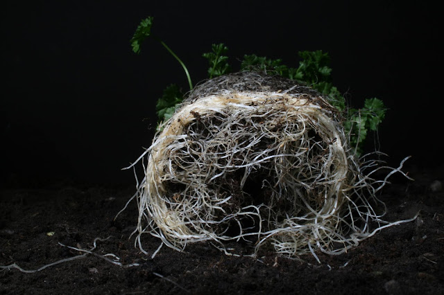
When further exploring the idea of Nadege Meriau's work and looking at roots I am mainly inspired by the roots within her photos. I like the use of soil and dirt to add texture to the image. Specifically during this shoot I would like to focus on the idea of destruction within the roots of flowers. I feel as though she incorporates this within her photos by making the soil look as though it has been thrown over the backgound and almost looks as if the flower has been pulled straight from the ground. I would like also like to look at the contrast between the fresh flower and the broken and destructed roots.

During this shoot I have decided to expand upon the ideas that I already looked at by looking at some of Nadege Meriau's series that she created. The image above is a photo of honeycomb that she has taken from an interesting perspective in order to make the viewer question what is actually being taken. I would like to build upon the idea of manipulating objects to make photos seem more unique and different. Whilst doing this I want to keep with the idea of looking at the roots of plants.


Contact Sheet


This shoot has been successful because I have explored the use of soil and roots within pictures in more depth and also in dfferent ways than I previously have within my project. I feel as though during this shoot Iahe successfully expanded upon my inspiration from Nadege Meriau's work. An unsuccessful element of this shoot is that due to holding the camera by hand and not using a tripod I found some issues with me being in the way of the light sources resulting in some of the photos being slightly too dark.

My Best Images

F/29    1/125   ISO 200
I have chosen this image because I like the composition of the photo. I like the way the main focus of the image is on the roots of the image. I also like the contrast between the roots of the two different plants. I also like the shadow that has been created by the leaf of one plant resting in front of the other. I think this creates a harsh shadow within the photo and makes the lighter areas surrounding the shadow stand out.

F/29    1/125   ISO 200
I have chosen this as one of my best images because I like the use of shadows and the composition of the image. When taking this photo I decided to move the snoot lighting attachment to the right side of the plant which projected the light onto the plant from a different angle. This resulted in parts of the plant being in darkness which I like because I think it gives the photo a sense of mystery.

F/22    1/125    ISO 200
I have chosen the image above as one of my best images because I like the busy composition that I created. I think that this is different to many of the other photos that I have taken because they mainly focus on one plant however this one includes three different plants that take up a large part of the frame of the image.

F/22    1/125    ISO 200
I have chosen the image above as one of my best images because I like the use of shape and shadows within the image. I feel as though the leaves of the plant create an interesting shape and the detailed texture of the leaves gives the photo many intricate details. I do like the way the light in the photo is projected onto the plant from the right side of the photo. I think that this is effective as it creates harsh shadows and gives the photos a sense of mystery.

F/22    1/125    ISO 200
I have chosen this as one of my best images because the way that I placed the plant is very eye catching and unique. I feel as though the way the leaves are pointing upwards it gives the effect of the plant sitting in a bowl. By turning the plant upside down it contradicts the 'normal' photos of flowers you usually see therefore I like the unique element to this image.

F/22    1/125    ISO 200
I like the image above due to the roots within the plant. The roots in this plant are very white and stand out within the image. I also like the way the purple flowers compliment the white roots.


F/22    1/125    ISO 200
I have chosen this as one of my best images because I like the composition of the image. I like the creative way the objects have been placed within the frame of the image. I also like the way I have included negative space surrounding the plant because this allows people to see all the details within the plant. I also like the way the green and purple within the photo stands out as they are the only saturated colours in the photo.

F/22    1/125    ISO 200
I like the image above because of the detail that was captured within the soil of the plant. Although the ligh is focused on the leaves of the plant I would like to brughten up the destructed roots in photoshop because I think this should stand out within the photo.

F/22    1/125    ISO 200
I have chosen this as one of my best images because I feel as though the angle at whichthe photo has been taken makes the plant look slightly distorted. Due to the camera being closer to the bottom of the plant I feel as though this part looks slightly enlarged and therefore stands out. I do feel as though the plant is slightly too dark however this can be fixed using the burn and dodge tool in photoshop.

F/22    1/125    ISO 200
I have chosen the image above as one of my best because I like the perspective the phoot has been taken from. This is not obvious that a plant is being photographed and I think this is interesting because of the way the roots look messy and destroyed.

F/22    1/125    ISO 200
I have chosen this as one of my best images because I like the elements of colour within the photo. I like the way the white roots are still visibld in the photo because I feel as though this has connotations of something that was once alive is now ruined.


Images that require improvement

F/22    1/125    ISO 200
This photo requires improvement due to the image being underexposed. Although all of the photos used the same camera setting I did not use a tripod during this shoot as I wanted to capture anges that were easier to access by shooting freehand. Unfortunately for some of my photos this resulted in me blocking the snoot lighting attachment. This blocked the flash when I fired the camera and resulted in an underexposed photo. Once I realised this was a problem I decided to use a tripod to take some of the photos that required the camera to be very close to the object because then I could stand out the way and allow the flash to work.

F/22    1/125    ISO 200
This photo requires improvement due to the angle that I was taking the photo. I attempted to take the photo with the camera being held above the flower. I adjusted the light so that it was directed on top of the flower however I did not have the correct set up in order for this angle to work. There was not enough light available to reach the flower therefore most of the photo was very dark. I also did not think about the composiiton of the image as the flower is not in the centre of the image and there is a lot of negative space around the flower which I feel takes away the focus from the flower.

Camera Settings and Techniques

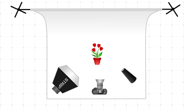
To complete this shoot I used a canon eos 400d. I did not use a tripod for the entire shoot as some of the angles that I wanted to capture worked better when I was shooting freehand. When shooting I began using one softbox light on the left of the setup. This was used to give this side of the image an element of light. I then used a snoot lighting attachment in order to focus the beam of light onto one element of the photo. I used a light meter to test the camera settings with the lighting settings that I used. I then used an f-stop of f/29 for the first coupld of photos that I took. I then felt as though the photos were slightly too dark so I measured the camera settings again and this resulted in me using an f-stop of f/22, which is the f-stop I used for the remainder of the shoot. I then used a shutter speed of 1/125 for the entire shoot. Although there was no movement in the photo I wanted to ensure that I froze action rather than risking any movement in the photo. This was relevent to this specific shoot because I was shooting freehand. This meant that if the shutter speed was too long then my hand may have moved the camera and I may not have frozen the action within the photo. I used an ISO of 200 throughout the shoot. This was because there was no natural lighting within the shoot so it was not bright enough to use ISO 100. Even though when you increase the ISO the quality of the photos decrease, I had to increase the ISO in order to capture photos with an even exposure.


A03

My main inspiration for this shoot came from other photos that I had previously not explored from Nadege Meriau. She completed a series where she photographed different foods like pumpkins and honeycomb and almost made the photos look like a landscape. The perspectives that she took the photos from were very interesting because they made the viewer question what object is actually being photographed. I felt very inspired by this however I also wanted to incorporate elements of her root series. Overall I decided to shoot using soil and plants that had been taken out of pots so you could visibly see their roots however I then manipulated this by placing flowers on top of eachother and turning them upside down. This added an artistic element to the photos which I feel was heavily influenced by Nadege Meriau's work. I have also gained inspiration from a number of photos from online. Two of the images I gained sinpiration from are located below. The main reason that these photos gave me inspiration I could not get from Nadege Meriau's work is because thee plants have been taken standing up. Meriau took all her photos of plants from a birdseye view. I explored this udeaduring my previous shoot in relation to this photographer therefore I wanted to go beyond the photographers ideas and incorporate some if my own ideas within the shoot.


Edits - Burn and Dodge Technique


Firstly I used the curves tool to increase the brightness of the image. I made quite a drastic change in order for me to brighten the image as much as I wanted to.
I then selected 'edit' then 'fill'. I ensured the contents was set to black and pressed 'ok'.

I then used the brush tool and made sure that the colour was set to white. I was then able to lighten certain areas of the photo. I altered the paint brush size depending on what part of the photo I wanted to lighten. This was because in some situations I needed to be slightly more specific. I then lowered the opacity to around 30%. This made it look a lot more subtle.


I then repeated the same process but I altered the curves to make the image slightly darker. I did not need to do this with every photo but for many of the photos there were small areas in the photo that I wanted to add darkness or shadows too to add slightly more depth.

I also used the clone stamp tool to correct some slight incorrections within my photos. In one of the images that I edited there was a leaf in the edge of the image. I used the clone stamp tool to fix this. Below is the before and after of the image that I edited.


I also increased thr exposure slightly for some of the images because I felt as though the entire image was slightly too dark.


My Final Images


Wednesday, January 16, 2019

Shoot 11

Shoot 11

Artist Influence - Marcelo Monreal

AO1: Develop ideas through sustained and focused investigations informed by contextual and other sources, demonstrating analytical and critical understanding.


I have completed a shoot in response to this artist before however I wanted to expand upon the initial edits that I created because I was not happy with them. Within the previous edits I aimed to copy the work of the artist however I would now like to use elements from his work but go beyond the artists ideas and create my own edits. I would like to incorporate the use of depth within my photos. This is something I feel Marcelo Monreal does extremely well within his work and I think this is because he draws the depth into the images physically rather than using computer experimentation. I would also like to incorporate the idea of using different flowers to look as though they are growing from the face however I do not want to manipulate the entire face, just a smaller section. I feel as though this will make my edits look more realistic which would over come the issues I had when looking at this artist in a previous shoot.   

Images that have inspired me 

The image above was the first image I saw that used this technique and I loved how effective this was. I think that it looks slightly more realistic than the edits by Marcelo Monreal. I think the reason for this is that Marcelo Monreal hand draws the flowers onto his photo therefore I think it is meant to look slightly more unrealistic. Trying to create this did not work for me as I felt it didn't look very natural and it looked like the flowers had just been simply placed on top of the portrait image. This is why seeing this image drew me in because I really liked how realistic the image looked. 

After finding this photo I did some more research into this technique and found the youtube video above. This allowed me to learn how to complete this technique. Throughout this tutorial I also learnt other skills which can be transferred across other areas of photography like how to add depth to an image.  

Contact Sheet - Flowers


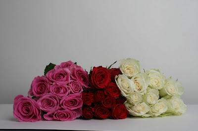
The first shoot that I completed was aimed at the use of roses. I did also include some dying or dead flowers within the shoot to add some variation however I wanted the main focus of the shoot to be on roses. I feel as though this shoot was successful because I was able to take many photos with different angles. This was something that I wanted to achieve because I was unsure of the way that I would be editing the images therefore I wanted to have a wide range of photos to choose from.  

Contact sheet - Portraits

I completed this shoot at home rather than in a studio environment. This is because I wanted to use models with a wide age range and it would not have been possible to do this in a studio as the models were not available. When completing this shoot I asked someone to hold a black blanket up behind the model. This became a difficult because sometimes it was not in the exact position that I wanted it to be. This was an unsuccessful element of the shoot however I did manage to get successful photos which I can use during my edits.

My Best Images 

AO1: Develop ideas through sustained and focused investigations informed by contextual and other sources, demonstrating analytical and critical understanding.

F/18    1/125    ISO 200
I have chosen this as one of my best images because I like the composition of the image. At the bottom of the image it is slightly out of frame however this is something that can easily be fixed in photoshop. Also with regards to the edits of these images I will only be using the actual flowers rather than the image as a whole.

F/22   1/125    ISO 200
I have chosen this as one of my best images because of the detail that I have captured within the flower. I like the way that the flower is in the centre of the frame. I also feel as though this will be a good photo to use when completing creative edits. I would like to slightly brighten the image because ideally I would want the white to look slightly brighter.


f/20   1/125   ISO 200
I have chosen the image above as one of my best because I like the composition of the image. I like the angle the photo has been taken because it allows you to see another element of the rose and you can see the flower from a different perspective. Due to roses being the main focus of the shoot I wanted to include many different ways to photograph that one flower.

F/18   1/125   ISO 200
I have chosen this as one of my best images because I liked the texture that the dying flower created. I feel as though including dying flowers within this shoot contrasted the fresh roses and has different connotations. For example including dying flowers may have connotations of growing old or love slowly fading away over time. I also like the saturated yellow within the image because yellow represents happiness but the flower is dying which may reflect people becoming unhappy.

F/18   1/125   ISO 200
I have chosen this as one of my best images because I like the way that the stalk of the flower is curving round and creates a leading line within the image. I think that this is very effective because it draws your eyes to the flower itself which looks very out of shape and irregular. The irregularity of the flower could have connotations of being unique.

Images that require improvement 

AO1: Develop ideas through sustained and focused investigations informed by contextual and other sources, demonstrating analytical and critical understanding.

F/16   1/125   ISO 200
This photo requires improvement due to the composition of the image. As I mentioned the entire shoot was based around roses therefore I wanted to incorporate many different angles in order to capture a range of images. I do not like the angle of this image and I feel as though the photo needs to have included more negative space surrounding the flowers. I do like the idea of having all three coloured roses within one frame but I think that I have captured this better within some of the other photos in the shoot. I do not like the way in which the photo has been taken from a side angle.

f/18   1/125   ISO 200
I have chosen the image above as one that requires improvement due to the fact that the image is slightly under exposed. I was using the correct camera settings when taking the photo however when capturing some of the images I did not use a tripod. This meant that I was standing in front of some of the light box when taking the photo. This resulted in me blocking some of the light that was aimed at the flowers which made this image slightly under exposed. I did take other photos from this angle but altered the way in which I was standing and this resulted in the photo being slightly brighter with better exposure. 


Camera Setting and Equipment

AO2: Explore and select appropriate resources, media, materials, techniques and processes, reviewing and refining ideas as work develops.

With regards to the first shoot that I completed in the studio I used a canon eos 400d to capture the images. I also used a tripod when capturing the majority of my photos because I felt like this made it easier to get the correct composition and desired frame of the image. To capture the photos of flowers I used two soft box light attachments which were pointed towards the table that the flowers were placed on. I used soft boxes because I wanted to create a soft, distilled light. I did not want any harsh lighting which would have been achieved through a snoot light attachment. Throughout the shoot I used an aperture range of f/18 to f/22. The aperture had to be altered depending on what object I was photographing. When photographing white roses I found that the aperture had to be slightly increased because white reflects more light. This meant that by increasing the aperture slightly the images of the white roses were more evenly exposed. If I were to leave the aperture the same then the photos would have been slightly over exposed. I used an ISO of 200 throughout the shoot because I was using unnatural lighting and ISO 100 would have meant that the camera was not sensitive enough to the lighting and the images would have been under exposed. Although using a lower ISO results in better quality photos, sometimes it is not possible to use the lowest ISO settings on the camera. The shutter speed remained the same, 1/125,  throughout my shoot as well. I wanted to freeze motion throughout the shoot. If I had have increased the shutter speed the shutter would have been open for slightly too long and the image may have had an element of blur to it.

The second shoot that I completed based on portraiture was completed in my house. This made it harder to control the lighting and it was also harder to get a perfect background. In order to try and minimise these problems I had m models stand next to a large window to use as much natural light as possible. I also had to ask someone to hold up a black blanket as a background which meant that this was slightly inaccurate on multiple occasions. In order to ensure I got the desired photo I took each photo and then looked at how the photo came out and directed the model and the person holding the background accordingly. With regards to the camera settings of the camera, I had to alter them multiple times before I found the came settings that worked for the conditions that I was photographing in. For each of the photos I used an aperture of f/4. This was because there was limited lighting and by using  lower aperture the camera was able to capture more light due to the size of the lens opening being larger. I also used an ISO of 400. I did try to use ISO 200 however the images were too under exposed therefore I decided to use ISO 400 in order to capture a better exposure.

AO3: Record ideas, observations and insights relevant to intentions, reflecting critically on work and progress.

When gathering ideas for this shoot I focused on experimental editing of the images. My main inspiration for this shoot was Marcelo Monreal. I completed a previous shoot based on his work however I decided not to continue with this idea as I did not like the way the edits turned out. Below is an example of one of the edited images I created from shoot 4. I decided that I wanted to expand upon this idea by doing some research into portrait photography and the different ways in which these can be manipulated. I consequently found a video on youtube named 'Photoshop tutorial - Flower Face Effects'. From this tutorial I learnt the technique that I have displayed in my edits. I feel as though these photos look a lot more realistic than my previous photos that I edited in response to Macrelo Monreal. The main element that I feel has made a lot of difference to the edits I have completed is learning how to add depth into photoshop. I think that this resulted in the images looking a lot more realistic. This is something Marcelo Monreal displays within his work however I did not have the photoshop skills in order to do this. 


   Edits

AO2: Explore and select appropriate resources, media, materials, techniques and processes, reviewing and refining ideas as work develops.


Firstly I dragged the portrait photo into photoshop that I wanted to use.  

I then created a new layer. 

I then selected 'edit', 'fill' and selected black. This resulted in there being one background and a new black layer. 

The next step was to duplicate the background layer and rename it 'model'. I then dragged the 'model' layer above the new black layer that I created. 

I then selected the pen tool which I used to cut out the shape on the face. The reason I used the pen tool rather than ay other cutting tool, like the lasso tool, is because the pen tool allowed me to get perfect curves and straight lines. This tool is more precise. 


Once the entire shape had been outlined I then right clicked with my mouse and selected 'make selection'. 

I then used the marquee tool. 

I right clicked again and selected 'Layer Via Cut'. This cut out the selection that I had previously made and made it into its own layer. 

I then repeated this process for another part of the face. This was no something I did for every edit however I did do it for some of them. 

This was the final outcome. 

I then double clicked on the 'model' layer and selected 'Bevel&Emboss'. I then altered these settings to what you can see above. This ceased depth to the layers which made the cut outs on the face look a lot more realistic. 


I then copied and pasted the image of the flowers that I wanted to use into this open file. Once this was done I ensured that this layer was located below the face layer. This ensured that the flower would be behind the cut out parts of the face, giving the illusion that the flowers were growing out of the models face.

I then created a mask on the flower layer. I then clicked 'edit', 'fill'. I then selected black. Once this was done I then used the pain brush tool and ensured that the colour was white. I then painted over the parts of the flower that I wanted to be visible. This allowed me to keep some shadows in order for the entire edit to look more realistic.


My Final Images

AO4: Present a personal and meaningful response that realises intentions and, where appropriate, makes connections between visual and other elements.